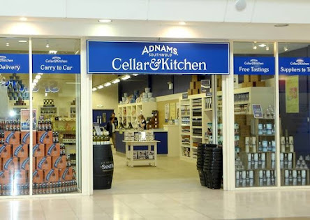
Adnams were looking for help in developing a new promotional campaign. We saw a more pressing issue. Their brands had grown independently of each other and it had led to a very disparate feel. The Hotels were different to the shops which were different to the pubs and beer. There was very little gluing it all together. So before we tackled the promotion we proposed a brand refresh that would turn them into a consistent house of brands.
We brought everything back to the provenance of their home – Southwold. The logo was updated with and incorporated the word Southwold. A
typeface was cut that was inspired by the boat yards around their town. Everything was brought up to date from pubs to retail. This refresh gave them an authentic platform to be able to tell the local stories that make
their brand unique.